Network Wireless Solutions
A new identity for a telecommunications pioneer.
To reintroduce itself after a merger with Canada’s Gap Wireless, Network Wireless Solutions, or NWS, tapped Rivers for a brand refresh. We built a new messaging framework centered on imaginative telecom solutions, iconography that evokes accessibility and a color scheme that honors the legacy of previous brands.
Our Expertise
- Design
- Brand Strategy
Capabilities Provided
- Template Creation
- Public Relations
- User and Market Research
- Design Systems
- Visual Identity
- Illustration & Iconography
- Brand Manuals & Guidelines
- Brand Platform
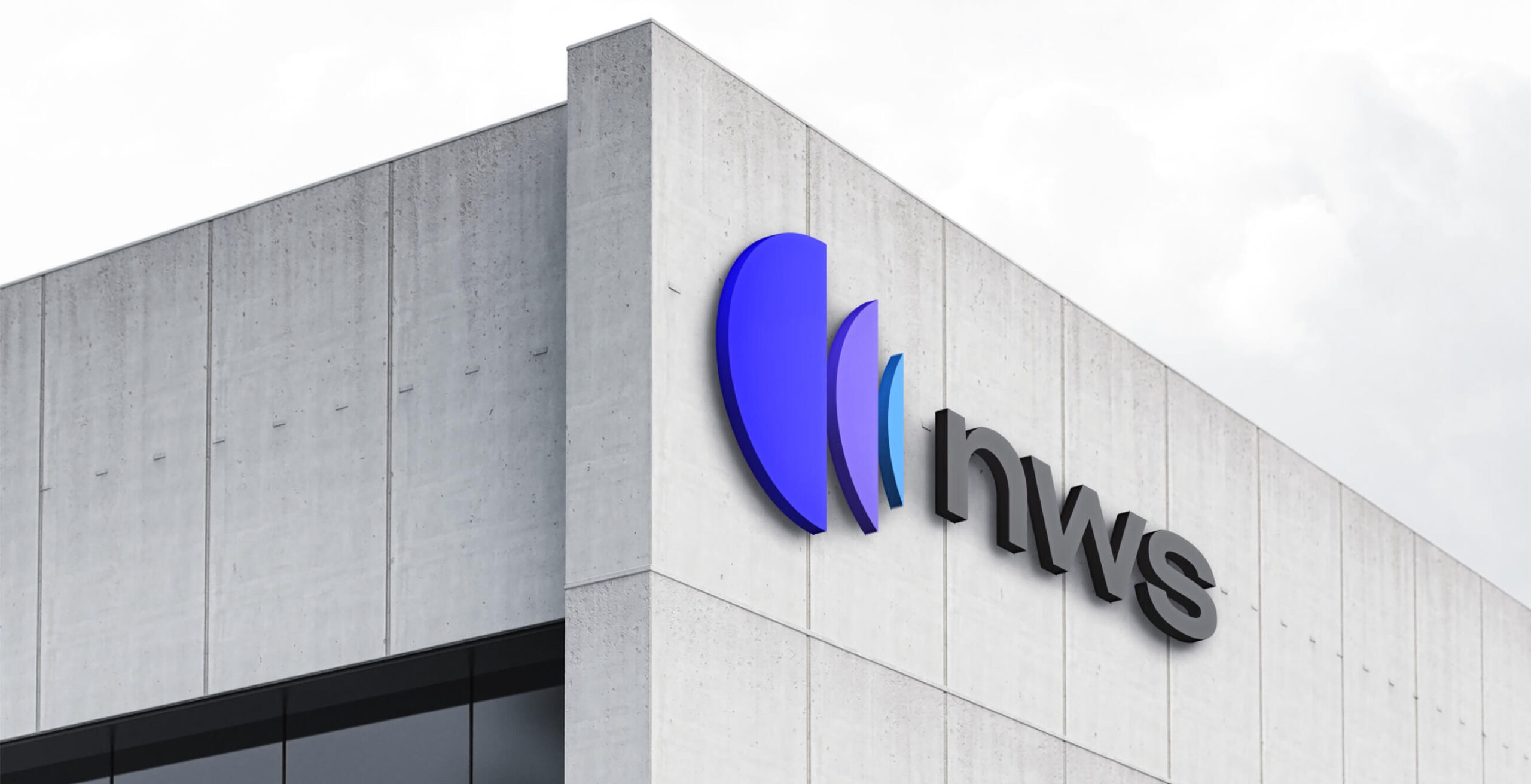
We created a dynamic logo by putting a unique spin on the pulsating semicircle, a universal motif for connectivity. The centrality of purple honors Gap Wireless, which forwent its old, red-dominant logo for NWS blue following the acquisition.


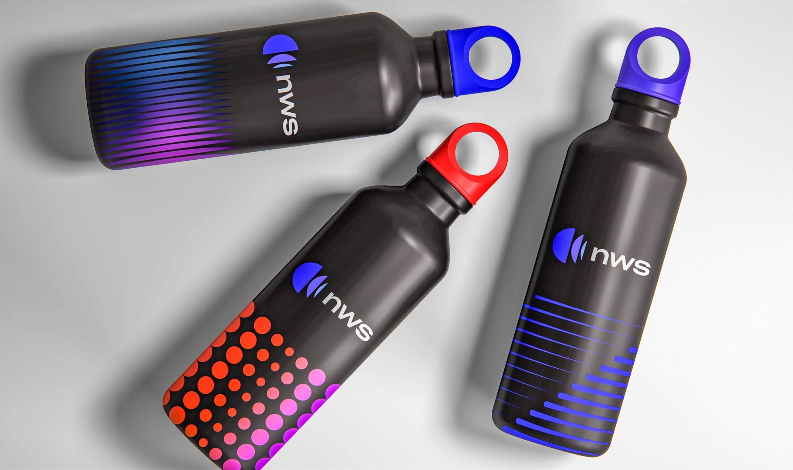
Like the array of services NWS provides, their new patterns are diversified and expansive. Our team stratified patterns into three levels: simple, to represent abstract concepts in their most basic form; intermediate, to accompany text or photography; and complex, to generate further visual interest.

A telecommunications brand isn’t complete without an extensive set of icons. Brochures, manuals, sales sheets and more rely on visual shorthand to represent business units and technical capabilities, so we created a custom, two-color icon library for distinctiveness and clarity.
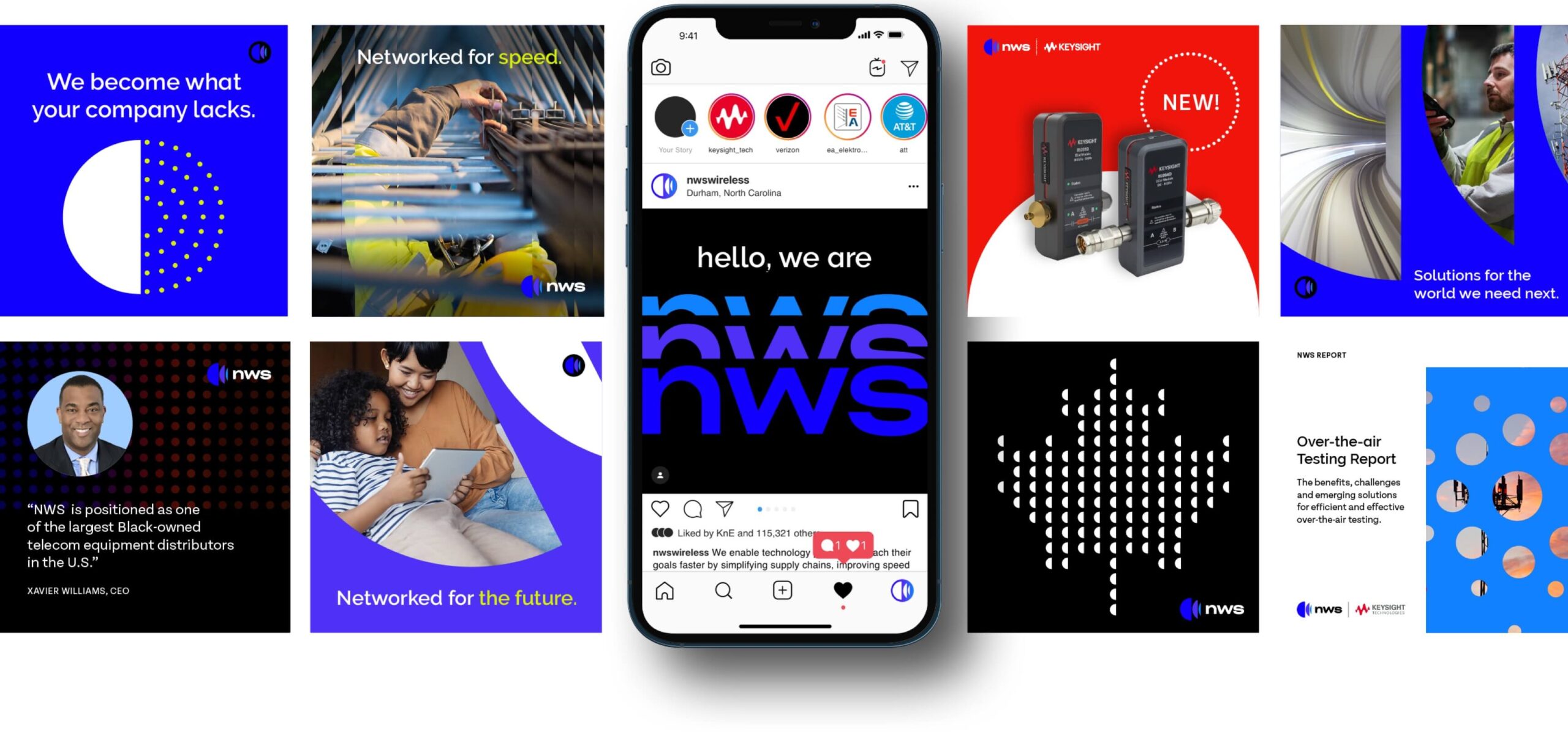
Our new logo and branding personifies our connection to telecom, our commitment to listening to our customers, and our own culture of growth and innovation. Our company is a technology enabler, and the new logo is the next evolution of our most important brand asset. It clearly represents everything we are doing today and the many ambitious things we aspire to do in the future.