Today’s successful brands must have clean websites with stunning designs and easy navigation to ensure an intuitive user journey and to elevate their brand identity. As one of the most widely used content management systems (CMS) in the world, WordPress offers unmatched versatility in designing and developing cutting-edge websites. The WordPress CMS features hundreds of customizable templates and thousands of plugins, so every user has complete autonomy over how their website looks, operates and evolves. The website designers at Rivers Agency are WordPress experts and know how to deliver results no matter your business goals. Read below to discover five great WordPress designs.
Whitespace WordPress Designs
Today’s users prioritize clean websites for easy navigation, as sites with cleaner designs keep users engaged for longer periods of time and reduce bounce rates. A crisp interface with decreased clutter is one of the most effective ways to clean up your website design and ensure a seamless user journey throughout each page. Accordingly, website designs that feature a significant amount of whitespace make it easy for users to understand the information on a website page and minimize any distractions that might take away from your brand’s message or specific calls to action.
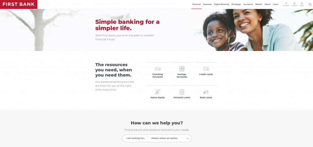
The team of web designers at Rivers Agency created First Bank’s website with these best practices in mind. Each page of First Bank’s website includes engaging content that is balanced with whitespace to increase interactions and lead website visitors through the user journey.
Video WordPress Designs
As the single most engaging form of content found on the internet today, well-produced and strategically implemented video messaging improves the user experience and elevates a brand’s online presence. Specifically, when video appears within a business’s website, it makes it easier for the brand to form connections with valuable visitors and deliver an easily consumable message to encourage the viewer to take action. Additionally, when visitors watch a brand video within the site, they are more likely to spend more time browsing the website to learn more about the business and explore its products and services.
At Rivers Agency, we know the power of video. We designed Glen Lennox Vision’s website with a compelling brand video that appears above the fold on the home page of the website. This brand video is an aesthetically pleasing first piece of content visitors see when directed to the website’s homepage. Accordingly, this element of the business’s website design effectively encourages visitors to learn more about the brand from the moment they enter the site and forms a connection with the audience that educates them about products and services as they travel throughout the rest of the pages.
Slider WordPress Designs
Homepage sliders are an extremely popular website design element, as they make it easy to deliver more information in less space and highlight specific value propositions. Most sliders include direct and overt calls to action that take viewers to a new page within the website and encourage them to continue along the sales journey. Specifically, sliders on the homepage of a website immediately grab a visitor’s attention and directly communicate a powerful message through text and imagery to keep users informed and interested from the first moment they land on the site.
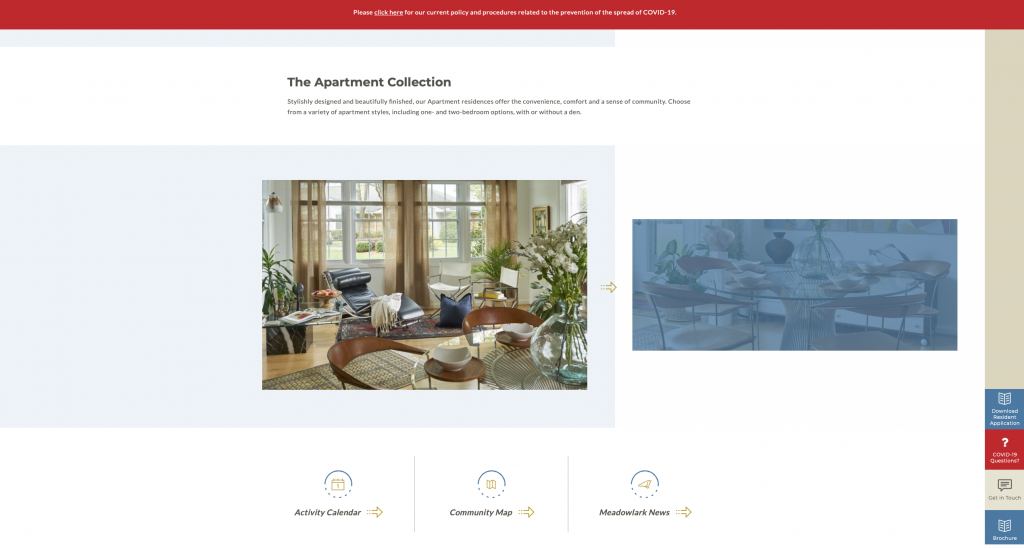
Our team of website designers incorporated a slider within the homepage of Carolina Meadows’ website that features stunning imagery coupled with clear language and a direct call to action to further explore the gallery of the business’s offerings. Additionally, sliders are implemented throughout the website to encourage users to browse the brand’s offerings and value propositions at their leisure and to improve the overall user experience.

Asymmetrical WordPress Designs
One of the leading website layout designs of 2021, asymmetrical website design is a popular choice for many of today’s most relevant and competitive brands. While balanced grid layouts have long been the dominant trend in site design, asymmetric layouts offer a refreshed look and feel and attract the eye organically to help brands stand out from their competitors. The best asymmetric designs still balance out colors and content throughout all aspects of the webpage, but with a more creative and less constrictive flow than traditional grid-like layouts.
Our website designers implemented slight asymmetrical designs throughout Ground + Space website’s homepage to provide dimension and attract a user’s attention in a more unique way. Accordingly, the homepage breaks up content through an unbalanced and edgier design that users will remember.
Parallax Scroll Animations
As website design becomes more dynamic, brands must optimize their website from every angle to ensure target audiences stay interested and engaged while searching through each page. Accordingly, when implemented properly, parallax scroll animations offer a unique and subtle way for a brand to engage with its website visitors. The best parallax scroll animations enhance the existing content on a webpage without taking away from it.
With this trend in mind, our team of website designers implemented subtle parallax scroll animations within the UNC Gillings School of Global Public Health website to layer in dimension and enhance the traditional, static scroll. As a user scrolls through the website, information gradually fades into view for a more rhythmic and interesting journey throughout the site.
Looking for a clean, cutting-edge website to enhance your digital presence? Rivers Agency is an award-winning team of designers and developers committed to creating stunning website interfaces that facilitate a seamless customer experience. As a forward-thinking design agency, Rivers is a leading web designer in the Raleigh, Durham and Chapel Hill, North Carolina areas. Our team designs and develops websites that elevate your brand’s digital footprint and achieve your business goals. Let’s work together!
